PHOTOBOOKS PART 5: GETTING CREATIVE
Half the fun of making photobooks is thinking outside the box in how to present your photos. Here are 5 top tips to gain visual artistry.
All Photo Credits: (c) T J Allen Art
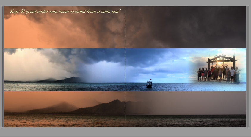
Top Tip 1: The Power of the Big Picture
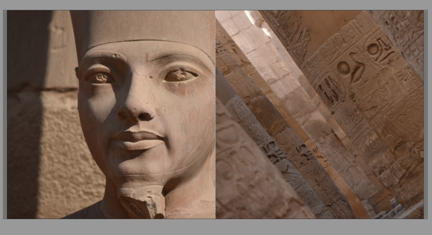
Oh yes! Just one picture across a double-page spread can have incredible impact. This image needs punch so it needs to be high resolution and dramatic. It works extremely well with landscape images where you need to show scale and a panoramic view. It is also great for images with strong lighting contrasts.
It's best not to have too many of these in the book because they will lose their wow-factor, plus you'll end up with a very expensive book because you'll have to keep adding more pages to display the rest of your images!
Top Tip 2: Big Picture vs Small Details
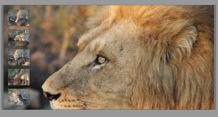
This is the next step along from a one-picture, double-page spread by adding a few contextual images to compliment and enhance the main image. You'll see from one of the examples below that I wanted to showcase how close the lion was to me, while setting the scene in which we found him i.e. dinner time! It didn't seem appropriate to have a large image of the lionesses on a wildebeest kill as some viewers of my photobook may have find it distasteful/distressing. Instead, I was able to show small multiple images that gave a sense of action without it being quite so in your face! I have to say, the lionesses were very systematic and hierarchical in their feeding process and it was fascinating to watch.
Top Tip 3: It's All in the Details
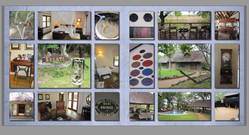
There is a great importance in capturing the 'un-obvious'! Wherever we go, we are so visually bombarded that our brains often disregard anything that isn't of great importance, but it's often these elements that make somewhere unique and different. Capturing everyday life images will ignite your senses, taking you back to recall memories that have faded over time.
If you are are staying in a standard hotel room that could be anywhere in the world, then I don't recommend bothering to photograph the plain and simple bedroom and bathroom, BUT, if you are staying somewhere incredibly unique then get snapping away!
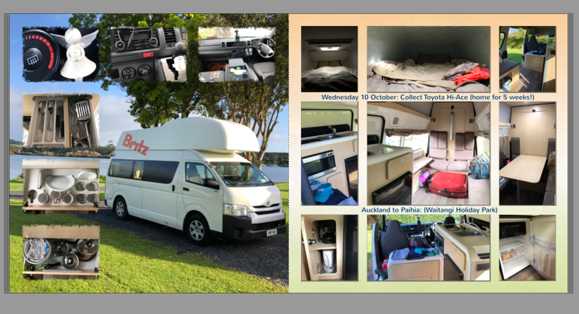
The campervan in New Zealand was my travelling home for 5 weeks, so I took photos of the kitchen drawers, the backseats and table area, the 'up-top' bed and the view of the driver's seat, because the van was an incredibly important part of my trip and I wanted to capture every part of it to help enhance my memories of the experience. (When I'm an old lady sat in a chair pouring over my past travel adventures, I want to be able to take myself right back there and envision exactly what it is like!).
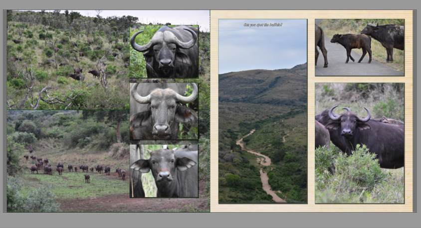
Top Tip 4: Focussed Subject Matter
Below is an example of how to keep a double-page spread focussed on a theme. I've added some contextual images that show how easily the buffalo slip into/blend into the African bush alongside some close-up details, including a 'daddy, mummy, baby' sequence to show how the animals differ from each other. For a bit of fun, I've also included a 'Where's Wally' image, or rather 'Where's the Buffalo' to see if viewers make good wildlife spotters!
Top Tip 5: Be Daring
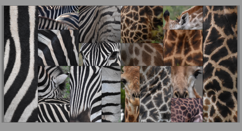
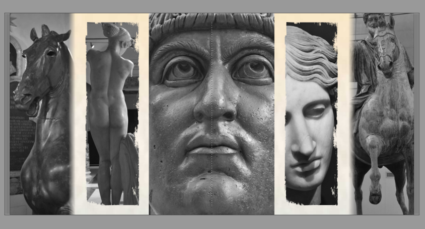
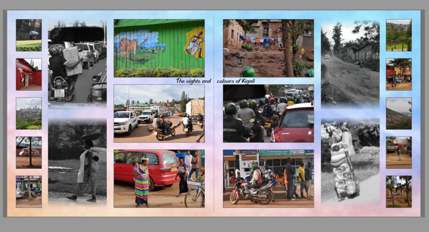
Every now and then, I like to do something completely different as you can see from the examples below. This is a chance to rip-up the rule book and let the creative juices flow.
